Creating a checkbox component in ReactJS
Or how to keep the messy stuff out of your business code
Jun 29 2020 9:52 • 2 min read
The Challenge
In HTML it is (still) not possible to style an <input type="checkbox"> (or radio and file for that matter). Often this is tackled by web developers by overlaying an existing input tag with some esoteric CSS.
The Solution
In component frameworks like ReactJS we have the opportunity to encapsulate all of this mess in a component and talk to a clean element in the rest of the application.
We can even drop the <input> tag altogether and swap either a checked or an unchecked image into place. In this case a checkmark from the well-known awesome icon library.
The component can be used as follows. Note that the content wrapped by the component will be treated as the label. And the label can be left or right aligned.
<Checkbox checked={isChecked} onChange={this.onCheckboxChanged} alignment={"left"}>
    the cleanest checkbox ever
</Checkbox>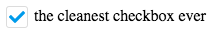
Here is the full source of the component:
import React, { Component } from 'react'
import { bool, oneOf, func } from 'prop-types'

export default class Checkbox extends Component {

  static propTypes = {
    checked: bool.isRequired,
    alignment: oneOf(['left', 'right']),
    onChange: func
  }

  static defaultProps = {
    alignment: 'left'
  }

  static checkboxBaseStyle = {
    width: 20,
    height: 20,
    borderRadius: 3,
    borderWidth: 1,
    borderStyle: 'solid',
    color: '009beb',
    display: 'flex',
    justifyContent: 'center',
    alignItems: 'center'
  }

  static containerBaseStyle = {
    display: 'inline-flex',
    alignItems: 'center'
  }

  constructor (props) {
    super(props)
    this.state = {
      checked: props.checked
    }
  }

  onClick = () => {
    if (this.props.onChange) this.props.onChange(!this.state.checked)

    this.setState({
      checked: !this.state.checked
    })
  }

  render () {

    let checkBoxStyle = {
      ...Checkbox.checkboxBaseStyle,
      borderColor: this.state.checked ? '#dcdcdc' : '#009beb'
    }

    let containerStyle = {
      ...Checkbox.containerBaseStyle,
      justifyItems: this.props.alignment === 'right' ? 'flex-end' : 'flex-start'
    }

    return (
      <section style={containerStyle} onClick={this.onClick}>
        {(this.props.alignment === 'right') &&
        <section style={{...containerStyle, marginRight: 6}}>{this.props.children}</section>
        }
        <section style={checkBoxStyle}>
          <svg width="16" height="12" viewBox="0 0 16 12" fill="none" xmlns="http://www.w3.org/2000/svg">
          {this.state.checked &&
            <path d="M5.43455 11.7314L0.234549 6.53136C-0.0778574 6.21895 -0.0778574 5.71242 0.234549 5.39998L1.36589 4.26861C1.6783 3.95617 2.18486 3.95617 2.49727 4.26861L6.00024 7.77154L13.5032 0.268606C13.8156 -0.0437998 14.3222 -0.0437998 14.6346 0.268606L15.7659 1.39998C16.0783 1.71239 16.0783 2.21892 15.7659 2.53136L6.56592 11.7314C6.25349 12.0438 5.74696 12.0438 5.43455 11.7314V11.7314Z" fill="#009BEB"/>
          }
          </svg>
        </section>
        {(this.props.alignment === 'left') &&
        <section style={{...containerStyle, marginLeft: 6}}>{this.props.children}</section>
        }
      </section>
    )
  }
}